The most important decision made by an investor in marketable securities is how to allocate investment capital among debt and equity. To help our investment advisory clients make the debt-equity decision, we present information in thought-provoking formats, such as the charts “Pictures of Risk and Return.”
I. Purpose
Pictures graphically illustrates the performance of different allocations of debt (bonds) and equity (stocks), represented by 5-Year Treasury Notes and the S&P 500 index, since 1926.[1]
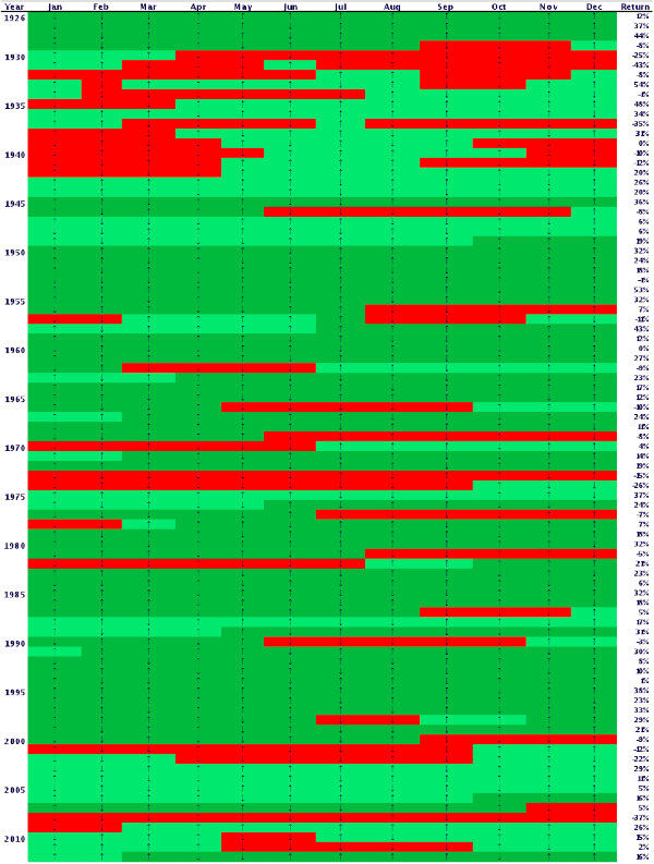
We have chosen to use colors to describe investment returns. The colors are intended to correlate with the emotional state of investors as they confront different market conditions. Red represents the shock, awe and depression experienced by investors as markets descend into a ditch. Light green stands for relief felt as markets come back from the bottom. Dark green implies the rush of seeing markets ascend to new heights.
II. Color Scheme
The monthly returns of the S&P 500 index are illustrated in Figure 1 on page 3 with the months along the horizontal and years going down the vertical so that the chronological progression is read like the words on this page. Each month has an arrow pointing up or down, signifying whether the monthly return was positive or negative. Annual returns for the calendar year are listed in the column on the far right. Color shading rules are applied as follows:
- Red – Period from when the market starts to decline by at least 10% until market reaches the lowest cumulative return following the start of a decline;
- Light Green – Period starting a recovery of at least 10% following a decline of 10% or more, and ending at either (i) commencement of another decline of 10% or more, or (ii) reaching the prior cumulative market high;
- Dark Green – Period starting at the previous cumulative market high and continuing until the next 10% decline commences.
For example, a dollar invested in the S&P 500 at the beginning of 1926 would have grown to $4.45 by the end of May 1946. By the end of November 1946, however, the $4.45 value of that investment would have fallen to $3.48, representing a drop of 22%. Therefore, the months of June through November 1946 are shaded red. The market began its recovery in December 1946 but the S&P 500 investment did not reach a value higher than the $4.45 again until October 1949 when the value of the S&P 500 investment reached $4.52. Therefore, the months December 1946 through September 1949 are shaded light green. The market continued to perform well for a number of years until the investment in the S&P 500 reached a new high of $20.58 at the end of July 1956 and began a decline of 10% through February 1957. Therefore, the months October 1949 through July 1956 are shaded dark green and a period of red shading begins again in August 1956.[2]
III. The Eye Test
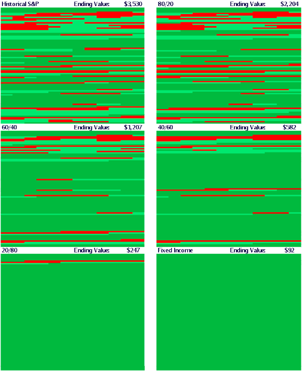
Pictures is effective in comparing different allocations among debt and equity investments.
Six different allocations are presented in Figure 2 on page 4 with each allocation identified as equity % / debt % in the top left corner and the value of one dollar invested in the allocation from the beginning of 1926 to the end of 2012 shown in the right corner of each Picture. As the eye moves down the page to lower allocations of equity, the impression of lower volatility, or risk, is apparent due to the decline in red and light green shadings. However, risk is evidently rewarded over time because the ending value of the investment is greater for the allocations showing a greater amount of red shading.
IV. Portfolio Statistics
The following table illustrates one of the most important rules of finance: risk and return are directly related. As return declines, so does risk, and vice versa. The Sharpe Ratio measures risk adjusted return on a relative basis. A higher Sharpe Ratio denotes a better risk adjusted return. It is noteworthy that the lowest Sharpe Ratios in the table are at the extremes, all equity or all debt. This should give pause to the investor who is either an aggressive risk taker, investing all equity, or an aggressive risk avoider, investing all debt.
Table 1: Statistics on Six Portfolios (1926 – 2012)
|
Arithmetic Avg Annual Return |
Ending Value[1] |
Standard Deviation[2] |
Sharpe Ratio[3] |
Max Monthly Loss |
Max 12 Month Loss |
|
| S&P 500 |
12% |
$3,043 |
20% |
0.41 |
-30% |
-68% |
| 80/20 |
11% |
$1,952 |
16% |
0.43 |
-24% |
-58% |
| 60/40 |
9% |
$1,099 |
12% |
0.46 |
-18% |
-47% |
| 40/60 |
8% |
$545 |
9% |
0.50 |
-13% |
-34% |
| 20/80 |
7% |
$238 |
6% |
0.52 |
-7% |
-18% |
| 5-Year Tsy |
6% |
$91 |
6% |
0.35 |
-6% |
-6% |
Figure 1: S&P 500 Picture of Risk and Return

Figure 2: Pictures of Risk and Return

V. Conclusions
Pictures is “painted” for the purpose of fostering an intuitive understanding of the relationship between risk and return. Investors react to market events emotionally as well as rationally. We use pictures as well as statistics to address the emotional as well as the rational side of the investor’s personality.
[2] The cumulative values referenced in these discussions reflect total returns, i.e. both increases and decreases in market values and dividends and interest payments.
[3] Value as of December 31, 2012 of $1 invested January 1, 1926.
[4] Volatility as represented by standard deviation is perhaps the most common measurement of risk. Volatility is not, however, a complete measure of risk.
[5] See Important Disclosures for more details on the Sharpe Ratio.
Important Disclosures
- Past performance is not a guarantee of future results. Values change frequently and past performance may not be repeated. Changes in investment strategies, contributions or withdrawals may materially alter the performance and results of a portfolio. There is always the risk that an investor will lose money.
- Even a long-term investment approach cannot guarantee a profit. Economic, political, and issuer-specific events will cause the value of securities, and the portfolios in which they are held, to rise or fall.
- Different types of investments involve varying degrees of risk, and there can be no assurance that any specific investment will either be suitable or profitable for a client’s investment portfolio.
- Economic factors, market conditions, and investment strategies will affect the performance of any portfolio and there are no assurances that it will match or outperform any particular benchmark.
- Debt is subject to interest rate risk because the prices of debt securities tend to move in the opposite direction of interest rates. In general, debt securities with longer maturities are more sensitive to these price changes and may experience greater fluctuation in returns.
- Securities of small companies are often less liquid than those of large companies. As a result, small company equity may fluctuate relatively more in price. Indexes are referred to for comparative purposes only and may not represent similar asset classes in terms of components or risk exposure; thus, their returns may vary significantly. The S&P 500 Index measures the performance of large cap US equity.
- Indices are not available for direct investment; therefore, their performance does not reflect expenses associated with management of an actual portfolio. S&P 500 index is not “investable” and does not reflect the deduction of any fees or expenses.
- Portfolios were constructed by varying the weighting of the S&P 500 and 5-Year Treasury Notes. Portfolios are assumed to have a constant percentage exposure to the equity and debt asset classes, which would assume continuous rebalancing. Without rebalancing, proportions of equity and debt would stray from the policy allocations in reality as one asset class outperforms the other.
- The Sharpe Ratio is a measure of excess return (return on the investment in excess of the risk free rate during the same period) per unit of risk and was developed by the Nobel Laureate William Sharpe. The Sharpe Ratio is calculated as follows:
 where “Risk free rate” is the return on the 30 day treasury bill and σ is standard deviation. Standard deviation measures the variance of returns around the mean of returns. The Sharpe Ratio assumes that risk is captured by the standard deviation of returns which may not be a comprehensive representation of risk for many investors. Sharpe Ratio measures comparative risk adjusted return; a higher number is better.
 - M-squared is another common measure of risk-adjusted return. See the White Paper, M2 – Measuring Risk Adjusted Return, for more details.
Sources and Descriptions of Data
S&P 500
Total monthly returns net of all fees in USD
January 1990-Present: S&P 500 Index
The S&P Data are provided by Standard & Poor’s Index Services Group
January 1926-December 1989: S&P 500 Index
Ibbotson data courtesy of © Stocks, Bonds, Bills and Inflation Yearbook™, Ibbotson Associates, Chicago (annually updated works by Roger C. Ibbotson and Rex A. Sinquefield).
5-Year Treasury Notes
Total monthly returns net of all fees in USD
January 1926 – Present: Five-Year US Treasury Notes
Source: Ibbotson Intermediate Five Year Treasury Notes
Returns used to construct portfolios incorporating both the S&P 500 and 5-Year Treasuries are monthly, with the portfolios rebalanced monthly.
[WP IM 29.4]